Currently, in the projects I’m working on, we use the Angular2+ framework as the base technology for the Frontend, so we save a lot of time that could be spent building a whole setup for the projects.
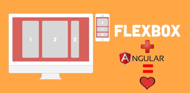
Although Angular makes us more productive and organized, I particularly always had doubts about which CSS library to use to structure the layouts, because in most cases I chose to use certain CSS libraries for their grid system that are usually made on top of Flexbox, such as Bulma.
Unfortunately using only CSS, it is not possible to control when the code should run some routine, such as: hide using the directive *ngIf determining element when resolution is less than 600px. Therefore, searching for an alternative coming from Angular itself, I found the wonderful module FlexLayout!
FlexLayout is an official Angular module that allows the control of the media query that is active in the current resolution of the application on some devices, being possible to register observers to run js routines when the resolution of the application changes (very useful in development mode) through a service. There are also several directives that use flexbox to build the application layout.
Table of contents
Open Table of contents
Great, but how do I use the module?
First of all, install the module in your application:
npm i @angular/flex-layoutTo use the module in a component, you will need to import it into the module of the component that will consume it:
import { FlexLayoutModule } from '@angular/flex-layout';

@NgModule({
  imports: [
    FlexLayoutModule
  ]
  ...
}),
export class Module { }
Ready! Now we can use the FlexLayout directives and service.
Nice! But how do I use these directives?
FlexLayout provides incredible directives to structure the layout, such as fxLayout, fxFlex and fxLayoutAlign. These directives can be used as follows:
<!--
fxLayout="row" === display: flex; flex-direction: row
fxLayoutAlign="center center" === justify-content: center; align-items: center
fxFlex="50%" === flex-basis: 50%
-->
<div fxLayout="row" fxLayoutAlign="center center">
  <div fxFlex="50%">Flex item 1</div>
  <div fxFlex="50%">Flex item 1</div>
</div>
All directives support suffixes for the default media queries alias: xs, gt-xs, sm, gt- sm, md, gt-md, lg, gt-lg, and xl. Using suffixed directives is very simple, a good example of using the mobile-first pattern would be:
<div
  fxLayout="column"
  fxLayout.gt-sm="row"
  fxLayoutAlign="start center"
  fxLayoutAlign.gt-sm="center start"
>
  <div fxFlex="50%" fxFlex.gt-sm="75%">Item 1</div>
  <div fxFlex="50%" fxFlex.gt-sm="25%">Item 2</div>
</div>
There are many directives that supply the most diverse functionality of flexbox, check it out by clicking here.
And how do I use the service?
To use the FlexLayout service is very simple.
Inject the service. Let’s say we want to use it in a component:
@Component({})
export class ExampleComponent {
  constructor(private media: ObservableMedia) { }
}
If we want to run some routine in the component whenever the resolution is greater than sm (which in this case would be gt-sm) we could do it as follows:
@Component({})
export class ExampleComponent {

  gtSmWatcherSubscription: Subscription;

  constructor(private media: ObservableMedia) { }

  ngOnInit(): void {
    this.gtSmWatcherSubscription = this.media
      .asObservable()
      .filter(() => this.media.isActive('gt-sm'))
      .subscribe(() => {
        // Some code here
      })
  }

  // Always remove subscriptions when the component has been destroyed.
  ngOnDestroy(): void {
    this.gtSmWatcherSubscription.unsubscribe();
  }
}
There is complete documentation on the ObservableMedia service in the FlexLayout repository, which can be accessed here.
Conclusion
For needs that go beyond CSS (like the one I presented in the article) FlexLayout can be of extreme help for what you want to do!
If this article helped you in any way, be sure to share and recommend it, I guarantee there are many people with the same needs!
Bye!